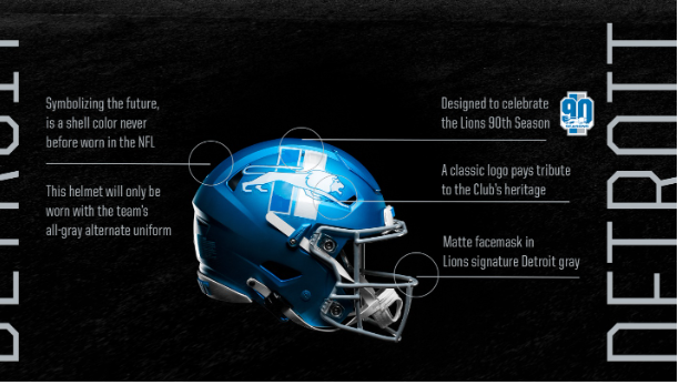
Grading the Lions New Alternate Helmet Design
The time has come! And the Detroit Lions new alternate helmet design has been revealed.
Image via Detroit Lions
So what do we think? I’ll start.
I’m into it. Though our signature Honolulu Blue wasn’t my top color choice, (I was hoping for a
shiny silver vintage look), the throwback logo was part of what I envisioned and I can see why they went
with it. The team blue plays nicely in the background of the retro logo and will add a POP of color to the
field. As for the logo itself: YES! In a league constantly updating and innovating, it’s nice to look back and
honor teams past.
My favorite element? The chrome but ALSO matte look finish. Style points!
Overall, the helmet combines the new and the old for a solid look. I’ve got to admit, I am a little
disheartened because this helmet would’ve looked dope with my favorite uni combo: white jerseys, blue
pants. But alas, they’ll likely bring the (needed, in my humble opinion) pizazz to the color rush uniforms
too.
Let’s hope the Lions’ season mirrors the new helmet’s vibe: out with the old (SOL), in with the
new (MCDC’s knee biting super team!). My final grade: “A-“. What say you, One Pride?

